Tuesday 19 March 2013
Monday 18 March 2013
Evaluation: Question 4- Who would be the audience for your media product? Why?
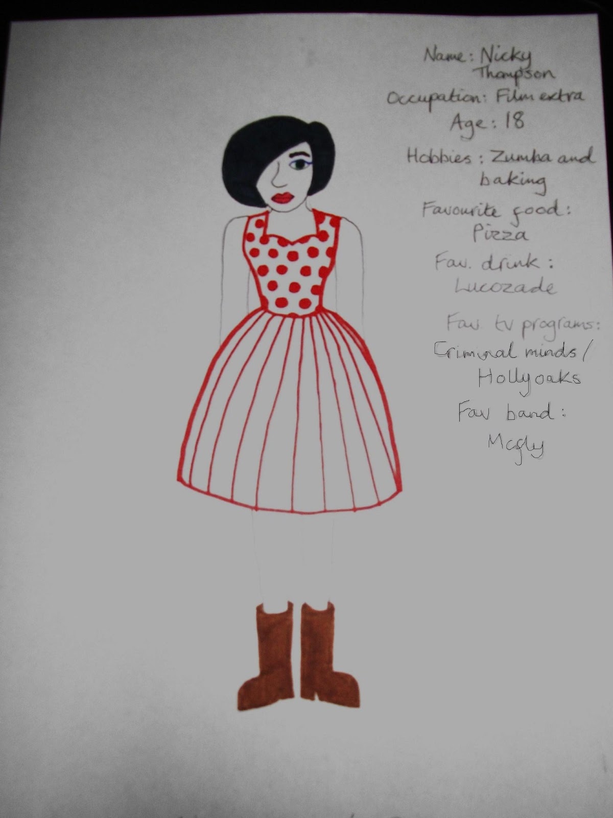
I have drawn a person who represents my target audience. I believe she would buy my magazine as she is interested in film/media as she is a Film Extra. Also her favourite band happens to be a pop band so she is more likely to buy it as they may be in it. She also fits into my target audience band (16-21) as she is 18 so is more likely to purchase the magazine as it fits her age range and the genre of music she likes. The target audience for my magazine would wear clothes that reflect the genre- stylish, modern, girly clothes in typical pop colours (pink, red, purple,white etc).
Tuesday 12 March 2013
Evaluation: Question 3- What kind of media institution might distribute your product and why?
Evaluation: Question 2- How does your media product represent particular social groups?

Angle- Each image is shot at eye level with the artist so we are staring directly at them, this makes up for the lack of eye contact (see expression). This should put the readers off, making them feel distant to us but the eye level shot brings us to the same level allowing some connection and portraying the artist as shy/closed off towards people.
Shot type- The shot for each image is a mid shot. This allows the audience to see the model/artists clothing and determine what genre of music they belong to. It also lets us see their facial expression and any props/instruments they are using.
Lighting- Both photos have good quality lighting and are very bright. The lighting in each photo points out the artists pale skin and exaggerates it, causing them to look even paler than usual. The brightness of my image makes my artist stand out from the background, but it also illuminates the contents of the shelves next to him which is quite distracting (also the shelves contents don't match the genre of pop). However Eds photo seems overly bright and he blends into the background quite a lot, he doesn't seem as prominent as he should be.
Costume- The costumes are very different in each photo. Ed Sheeran (the bottom photo) is wearing jeans and a blue hoodie. The hoodie is his statement piece and he is usually seen in it, that is how he is identified by his fans etc. My artist is also wearing blue, but a much paler shade. The checked shirt stands out against the rest of the photo and makes the artist look smart as if he takes pride in his appearance. His glasses also add an air of intelligence about him. In Eds photo his clothes are plain so that we focus in on his personalised guitar, while the shirt takes most of the attention in my photo.
Expression- Each model/artists expression is very different. My artist is hardly showing any emotion at all, he has a fairly blank expression and is giving an extremely small closed mouth smile. Ed Sheerans face is portraying a lot of emotion as he is very passionately singing. His eyes/brow are scrunched up and his mouth is wide open (mid song). Neither are making eye contact with the camera which makes us feel disconnected from them but this adds a shy, mysterious air to them.They still appear friendly.
Hair- Eds hair is very messy and sticks up in several places (like 'bedhead' hair), that is his signature look. Hair that looks like you've just gotten out of bed is a very popular style and very modern. This shows how he is up to date with modern trends and fashion. However my artist also has a very current look, even though his is the polar opposite to Eds. His hair has been straightened and is neatly groomed. Most young people either have the messy 'birds nest' style or have perfectly styled hair so both artists appeal to youths and the pop genre.
Makeup- Neither artists are wearing any makeup. This is partially due to the fact they are males, but also as they are both seated playing instruments it shows that their focus is the music. The aren't expected to put on a performance (fancy costumes, dance routines etc) as their music is the sole interest and they are fairly exceptional at it. Makeup is unnecessary for them.
My magazine represents youths by using makeup and costumes similar to people from the pop genre. The artists styles/appearances reflect those that are popular and familiar with youths. My magazine can be related to by this group as I have positioned my artist in a similar way to other pop artists. Also I have used a camera shot that is commonly used for this group.
Evaluation: Question 1- In what ways does your magazine use/develop/challenge forms of conventions of real media products?

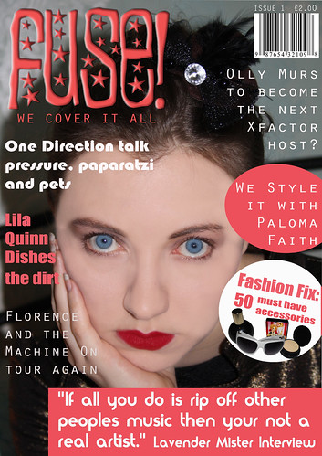
- Use: My magazine uses the same type of graphics as this 'Top of the Pops' magazine. I have copied the cover line being in a pink circle as pink is a very common pop colour and circles/curves are reminiscent of pop (pop is a word that can be associated with bubbles and bubbles are round). I've even put it on the same side as the other magazine, and placed it so it overlaps my main image. Like the 'Top of the Pops' magazine I have also made my cover model central, with a mixture of cover lines/graphics either overlapping or separate to the main part of the image.
- Develop: I have developed parts of my magazine to appear different from the professional magazines. Like the 'Top of the Pops' magazine I have included a cover line about fashion that has images of the products featured in it. However my images are significantly smaller than the real magazine, the cover line with it doesn't stand out as much (doesn't use different fonts, colours or sizes), the story is positioned inside of a graphic so it stands out against the image (the other doesn't need to due to its white background) and it is positioned at the bottom right instead of the top left.
- Challenge: My magazine challenges real media products ( the 'Top of the Pops' magazine) as the cover photo is a close up of the model and not a mid shot. Also my models appearance is extremely different, you can see her eyes better, her hair is pinned up and she has less eye makeup and more/brighter lipstick. While I have still used a pink masthead to connect to my pop genre, my masthead is in the top left corner of my magazine and doesn't span across the whole page. I have significantly less images on my front cover than the professional one.

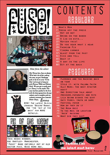
- Use: My magazine has the same text layout as the professional one ('Mizz') for its contents listing. The page is split into to halves and the contents is on the right side. Like mine the contents are split into sections, separated by headings. The page numbers are a different colour to the text and next to each image is a large page number that corresponds to a part of the contents page. My contents page also features an image of the artist mentioned in the magazine, like the real one my image is found on the left half of the page just above the halfway point.
- Develop: My contents page starts to differ from the 'Mizz' magazines as I have placed my editors letter/welcome paragraph further down the page and included an image of the editor herself (instead of a cartoon image). My images of the fashion section are found at the bottom right of my page instead of being with the artist images etc, also my images are larger and there are more of them.
- Challenge: My contents page looks completely different as my masthead is at the top left of the page and is at least 5xs the size of 'Mizz's masthead.

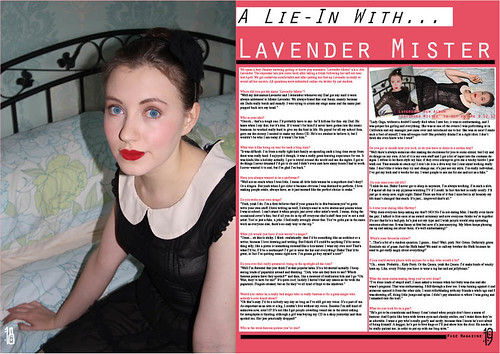
- Use: My double page spread also has an image dominating the entire left page, just like the professional one. Also the website for my magazine is written at the bottom right of the page and is a similar size to Cosmopolitan. Both articles are Q&A interviews and both used a different colour for the questions to make them stand out against the rest of the interview.
- Develop: My d.p. spread also has the artists name featured at the top right of the page, but it is reversed in its order. Unlike the Cosmopolitan d.p. spread, I have placed the artists name underneath the articles title. Instead of using two fonts like Cosmo, I have used the same font but have placed it in italics to create some contrast. Both articles have columns of text on the right page, but my d.p. spread has two columns instead of three, however they both split the article into paragraphs- a paragraph per question and answer.
- Challenge: My model is drastically different to the one on Cosmo. My artist has been photographed from a high angle on her left side using a mid shot, whereas the Cosmo artist is in a medium close up and is at eye level with the camera. The models each have a different style taste, Cosmos artist is in a large furry coat/jumper and is wearing large, chunky rings- these are both associated with richness and glamour. This connects to her story as she is a "Superstar Rising". My artist is dressed in a simple 1940's dress, with no jewellery and a plain flowered headband.
Subscribe to:
Posts (Atom)