Dear Moderator
Please find directly below my completed music magazine. My evaluation starts on the 12/03/13 and finishes on the 11/04/13. My research and planning starts on the 10/09/12 and finishes on the 12/03/13. I hope you enjoy my blog and my magazine, also I hope you think its awesome :)
Have a nice day,
Aimee

Thursday 11 April 2013

My Magazine


Enjoy :)

Evaluation: Question 7- Looking back at your preliminary task, what do you feel you have learnt in the progression from it to the full product?


My magazine layout hasn't changed drastically, I have simply improved my overall presentation since the preliminary task. My coverlines are still in more or less the same place and my masthead is still in the top left corner. However my photograph positioning has been more thought out since the original task (in the center of the page instead of placed randomly in the corner) and my Photoshop skills have improved. I have learnt to use the guidelines to help position my text to make it look neater and more professional.

The college magazine picture isn't good quality as I took it on the Mac instead of using an actual camera (such as an SLR), the light quality is poor. Using the SLR camera on my music magazine makes it a higher quality as I could zoom and focus. In the preliminary task I didn't understand how to properly use mise-en-scene to portray my genre (college). I could have used props related to college like textbooks or calculators etc. I have since learnt how to use makeup and costumes to portray my genre (pop).

I have since realised how colour and font size can help the magazines overall presentation. I've learnt how certain fonts/font sizes can portray the magazines genre. For example my music magazine masthead is suitable for the pop genre. I have used a slightly larger font for my artists name to show the reader that they are the main focus of the magazine. This shows my new understanding of font sizes and their effects.
 

My music magazines structure is much better than my college magazines as my text is aligned neatly in one column with headings and looks more professional than my college magazine. Unlike my preliminary task I have separated the text into sections with correctly corresponding page numbers (which makes it more professional) and have used a much smaller, realistic size text which ultimately fits more stories/information onto the page.

The text on my preliminary task is basic, boring and does nothing to grab the readers attention. The text is too thin and the colours do not stand out against the background, making it hard to read. I now understand that fonts reflect the genre and because of this I used a fun, bold impact font to make it stand out (and show the genre) whilst also adding adding a sense of fun.

There are a lot of gaps/blank spaces in my preliminary tasks. It is less noticeable as I have a coloured background but it is still obviously quite plain. I have since learnt how professional magazines utilise every inch of space so that the page contains as much information as possible and looks more appealing. Extra/blank space can be filled with additional images or text.

The photos on my college magazine were not well thought through and were rather carelessly taken (I didn't even use a real/professional camera). They do not look good and were quite horrendously edited (incorrectly cut out with jagged edges, shoddy colour editing etc). I now know how important it is to think about mise-en-scene and I have tried to take this into account in my music magazine. I have now included props like headphones and guitars etc that reflect the pop genre.

Evaluation: Question 6- What have you learnt about technologies from the process of constructing this product?

 I have used Blogger to document the process of how I've learnt to create a magazine and how I've made my music magazine. Also I've used it for evaluating my work. Each lesson I would upload at least one post to show what I'd done that day in class and show my progress.

 I have used Prezi in part of my magazine production and my evaluation.

 I used an SLR camera to take all my photos for my music magazine, this was because the SLR took good quality images, improving the magazines overall appearance.

 I used iPhoto to download my images to the computer and select the ones I wanted to use.

 I used Photoshop to create my music magazine front cover, contents page and double page spread.

 I have used iShowU in my Research and Planning and evaluation to document my blogs progress, highlight certain pieces of work and explain/discuss certain posts or my overall progress. Also to show the process of making my magazine.

I have used Flickr to talk about media distribution for my evaluation.

I have used PowerPoint to compare my magazine to existing ones for my evaluation.

I have used Facebook to gain some audience feedback from my blog.

I used InDesign to create my contents page and double page spread.


Unfortunately my computer was very slow when doing this video so many of my pages etc wouldn't load. Also the first time I tried to do this podcast it did not save.

Monday 18 March 2013

Evaluation: Question 4- Who would be the audience for your media product? Why?


I have drawn a person who represents my target audience. I believe she would buy my magazine as she is interested in film/media as she is a Film Extra. Also her favourite band happens to be a pop band so she is more likely to buy it as they may be in it. She also fits into my target audience band (16-21) as she is 18 so is more likely to purchase the magazine as it fits her age range and the genre of music she likes. The target audience for my magazine would wear clothes that reflect the genre- stylish, modern, girly clothes in typical pop colours (pink, red, purple,white etc).

Tuesday 12 March 2013

Evaluation: Question 3- What kind of media institution might distribute your product and why?

front cover
Please click on the photo to be taken to Flickr.
contents page

Please click on the photo to be taken to Flickr.
doublepagespread
Please click on the photo to be taken to Flickr.

Evaluation: Question 2- How does your media product represent particular social groups?


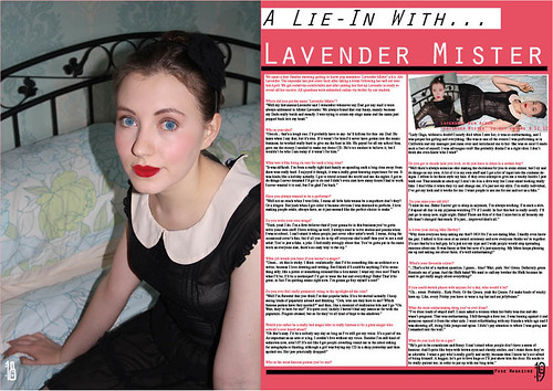
Posture/Gesture- Both models/artists have a similar posture. They are both sat down playing a guitar, each has their  left hand on the fretboard and their right hand over the soundhole, strumming the guitar. Each have bent their right knee higher to rest the guitar on and are hunched forward over it. This closed in body language shows that the artists sole focus is on playing their instrument, it also shows that they have an introverted personality and are quite shy/timid.

Angle- Each image is shot at eye level with the artist so we are staring directly at them, this makes up for the lack of eye contact (see expression). This should put the readers off, making them feel distant to us but the eye level shot brings us to the same level allowing some connection and portraying the artist as shy/closed off towards people.

Shot type- The shot for each image is a mid shot. This allows the audience to see the model/artists clothing and determine what genre of music they belong to. It also lets us see their facial expression and any props/instruments they are using.

Lighting- Both photos have good quality lighting and are very bright. The lighting in each photo points out the artists pale skin and exaggerates it, causing them to look even paler than usual. The brightness of my image makes my artist stand out from the background, but it also illuminates the contents of the shelves next to him which is quite distracting (also the shelves contents don't match the genre of pop). However Eds photo seems overly bright and he blends into the background quite a lot, he doesn't seem as prominent as he should be.

Costume- The costumes are very different in each photo. Ed Sheeran (the bottom photo) is wearing jeans and a blue hoodie. The hoodie is his statement piece and he is usually seen in it, that is how he is identified by his fans etc. My artist is also wearing blue, but a much paler shade. The checked shirt stands out against the rest of the photo and makes the artist look smart as if he takes pride in his appearance. His glasses also add an air of intelligence about him. In Eds photo his clothes are plain so that we focus in on his personalised guitar, while the shirt takes most of the attention in my photo.

Expression- Each model/artists expression is very different. My artist is hardly showing any emotion at all, he has a fairly blank expression and is giving an extremely small closed mouth smile. Ed Sheerans face is portraying a lot of emotion as he is very passionately singing. His eyes/brow are scrunched up and his mouth is wide open (mid song). Neither are making eye contact with the camera which makes us feel disconnected from them but this adds a shy, mysterious air to them.They still appear friendly.

Hair- Eds hair is very messy and sticks up in several places (like 'bedhead' hair), that is his signature look. Hair that looks like you've just gotten out of bed is a very popular style and very modern. This shows how he   is up to date with modern trends and fashion. However my artist also has a very current look, even though his is the polar opposite to Eds. His hair has been straightened and is neatly groomed. Most young people either have the messy 'birds nest' style or have perfectly styled hair so both artists appeal to youths and the pop genre.

Makeup- Neither artists are wearing any makeup. This is partially due to the fact they are males, but also as they are both seated playing instruments it shows that their focus is the music. The aren't expected to put on a performance  (fancy costumes, dance routines etc) as their music is the sole interest and they are fairly exceptional at it. Makeup is unnecessary for them.

My magazine represents youths by using makeup and costumes similar to people from the pop genre. The artists styles/appearances reflect those that are popular and familiar with youths. My magazine can be related to by this group as I have positioned my artist in a similar way to other pop artists. Also I have used a camera shot that is commonly used for this group.